NJC Large Format Banners
-
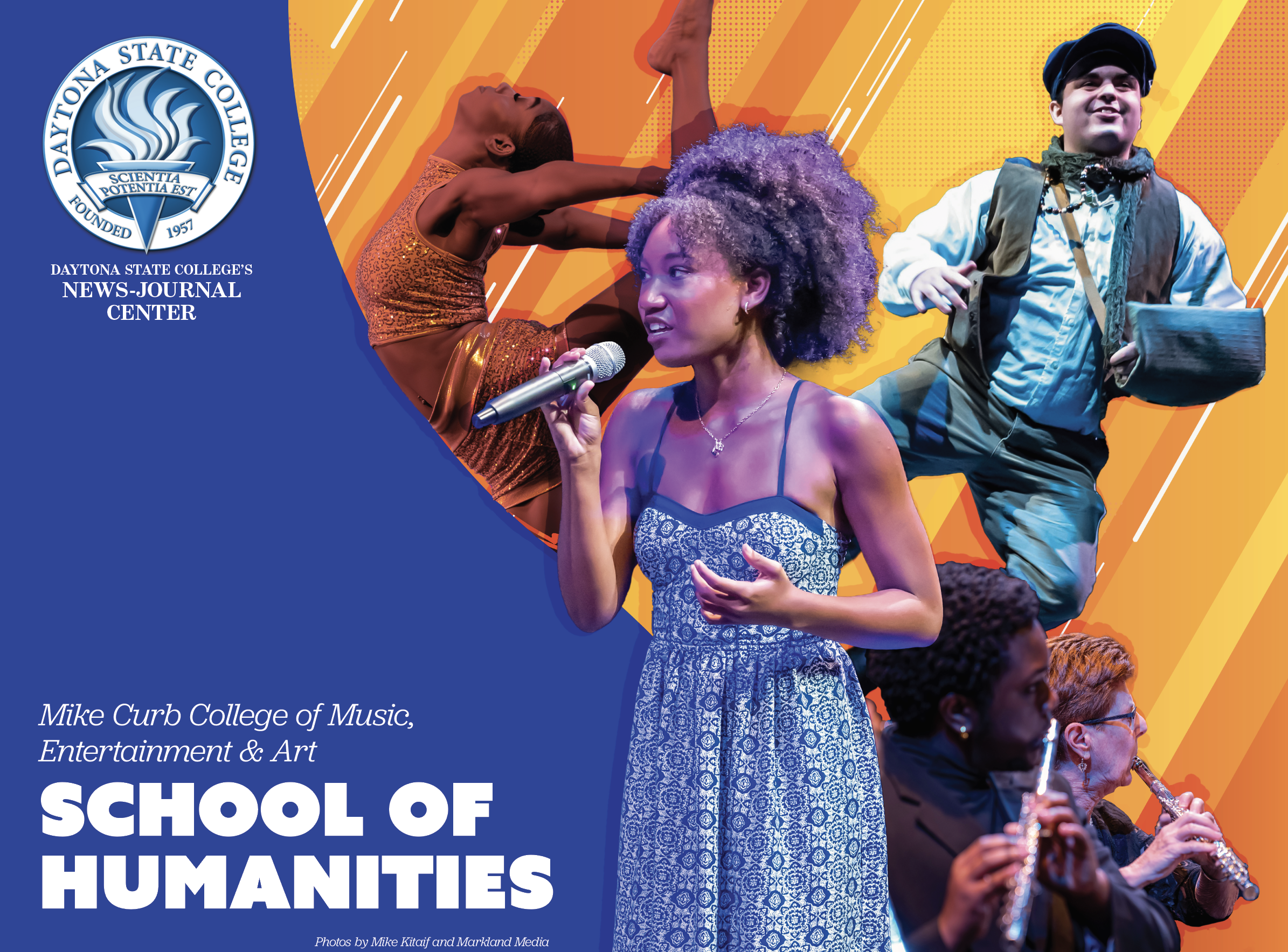
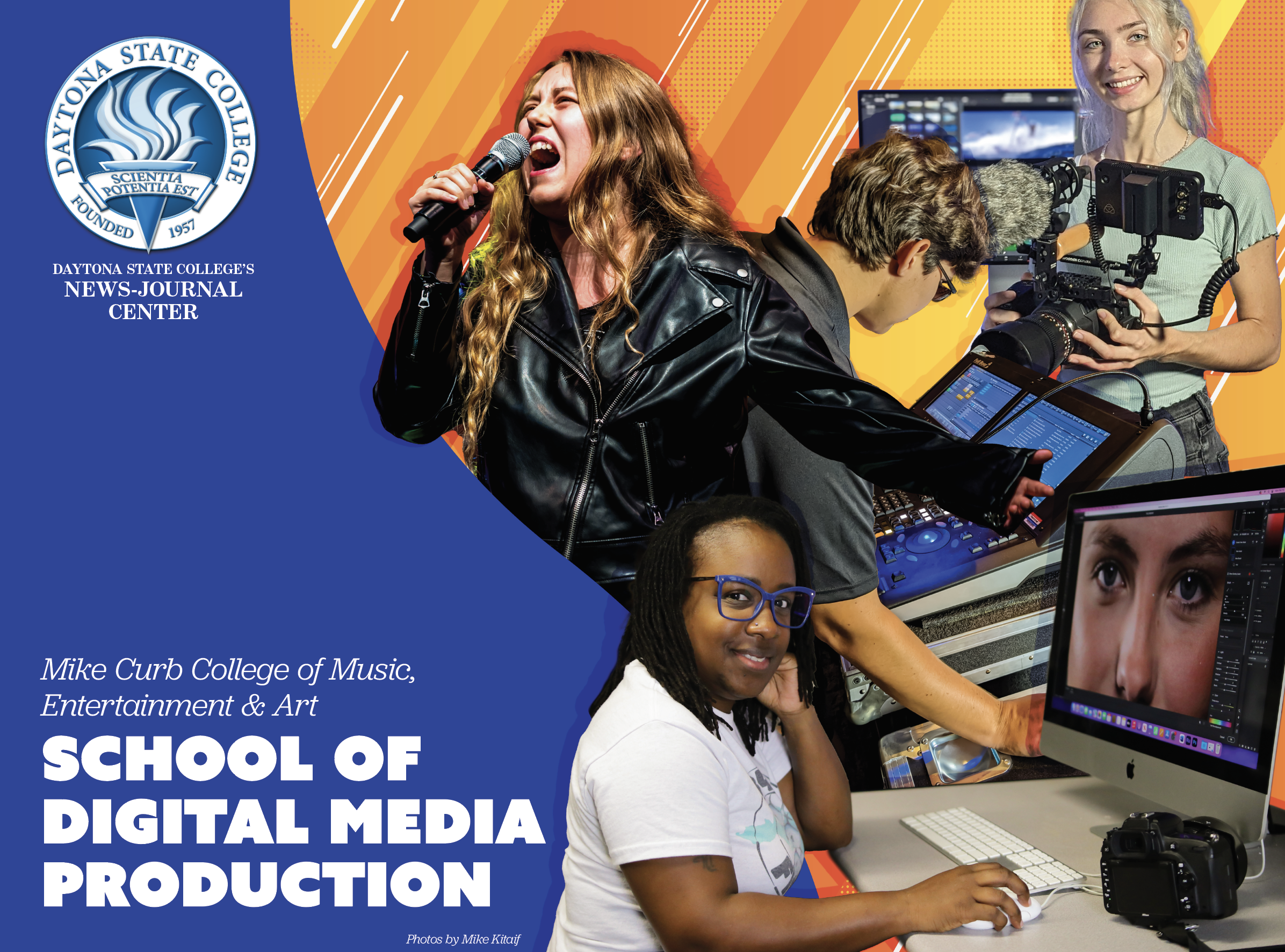
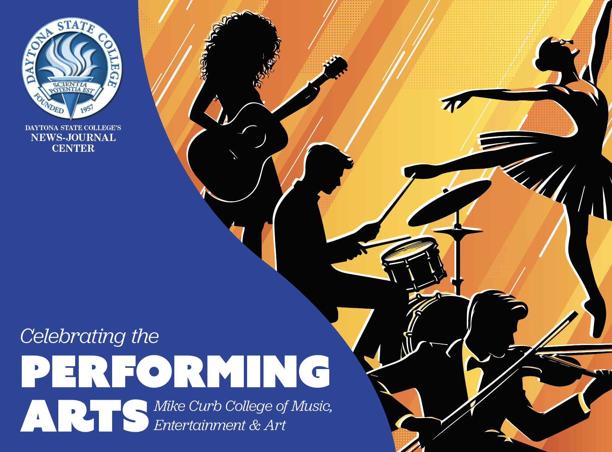
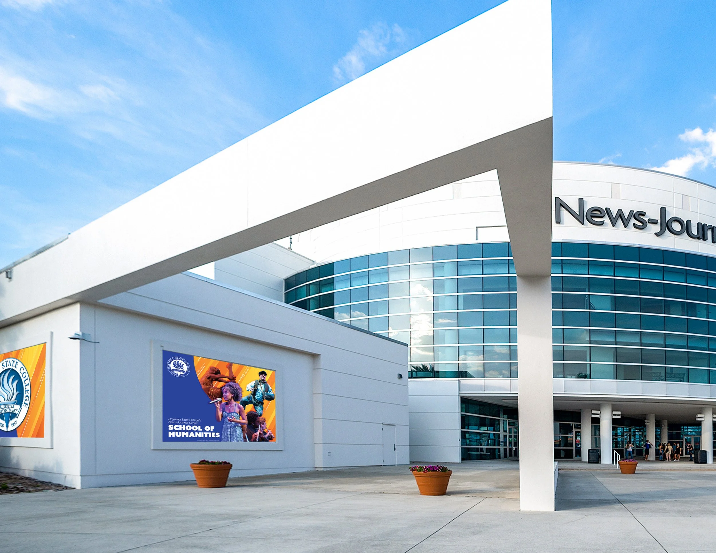
The scope of this project was to create five vibrant and eye-catching banners to attract more patrons, improve brand visibility, and get people talking about one of the largest performance venues in town.
While planning, I found that a unique problem presented itself—each of the chairs for the programs featured wanted a different aesthetic. One wanted silhouettes, another wanted theirs to match the branding for a different program they preside over, one wanted strictly photographs in a grid, and one wanted only blue and cool tones.
I asked myself four key questions:
What can I do to create impactful, eye-catching design that draws public attention on one of the most popular streets in town?
How could I incorporate elements of everyone’s wants for their banner?
How far could I take the project while remaining in DSC brand parameters?
How far could I go without sacrificing functionality, impact, and a cohesive feel?
-
When drafting out a plan, inspiration struck in the form of a collage-styled cutout look utilizing photography, color, and dynamic linear relationships. I used photography form some of the shows earlier in the year for the corresponding programs.
To draw the eye, I decided to use orange and yellow colors that are used in DSC branding and colors analogous to them. For typography I wanted to use a bold chunky sans-serif paired with a delicate italic serif to mirror the positive and negative space relationships within the logo.
-
Overall, my updates to these large banners improved brand visibility by 12%, raised knowledge of programs available by about 26% amongst regular NJC patrons, and developed a stronger link between Daytona State College and its News-Journal Center.
I art directed, designed, and edited all the photography. During the project, I collaborated with the News-Journal Center staff, program chairs, print vendors, marketing specialists, and photographers.