Dsc magazine Redesign | A Case Study

-
Creating a redesign to pull the magazine into a more modern identity— because a school with programs like ours deserves to shine. When I did my research, archiving and leafing through magazines from years past, three key facts stood out to me.
The magazine didn’t seem to have any set “brand.” Each spread felt like its own completely different element.
There were a lot of typesetting issues and problems with document formatting.
We had come to the consensus that the whole look and feel of the magazine felt quite dated.
-
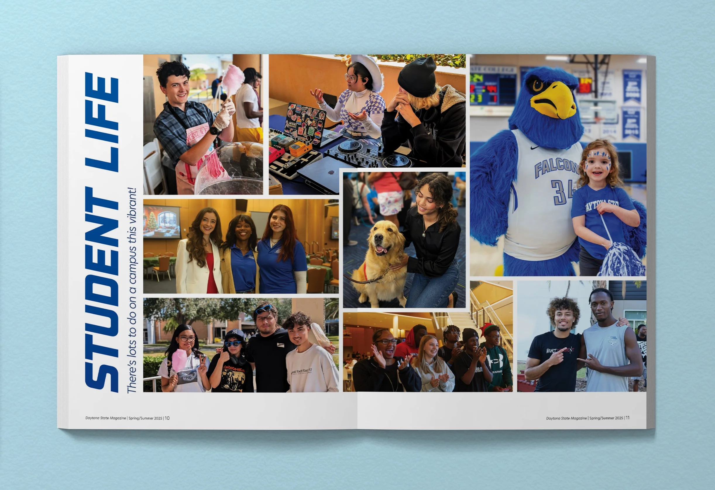
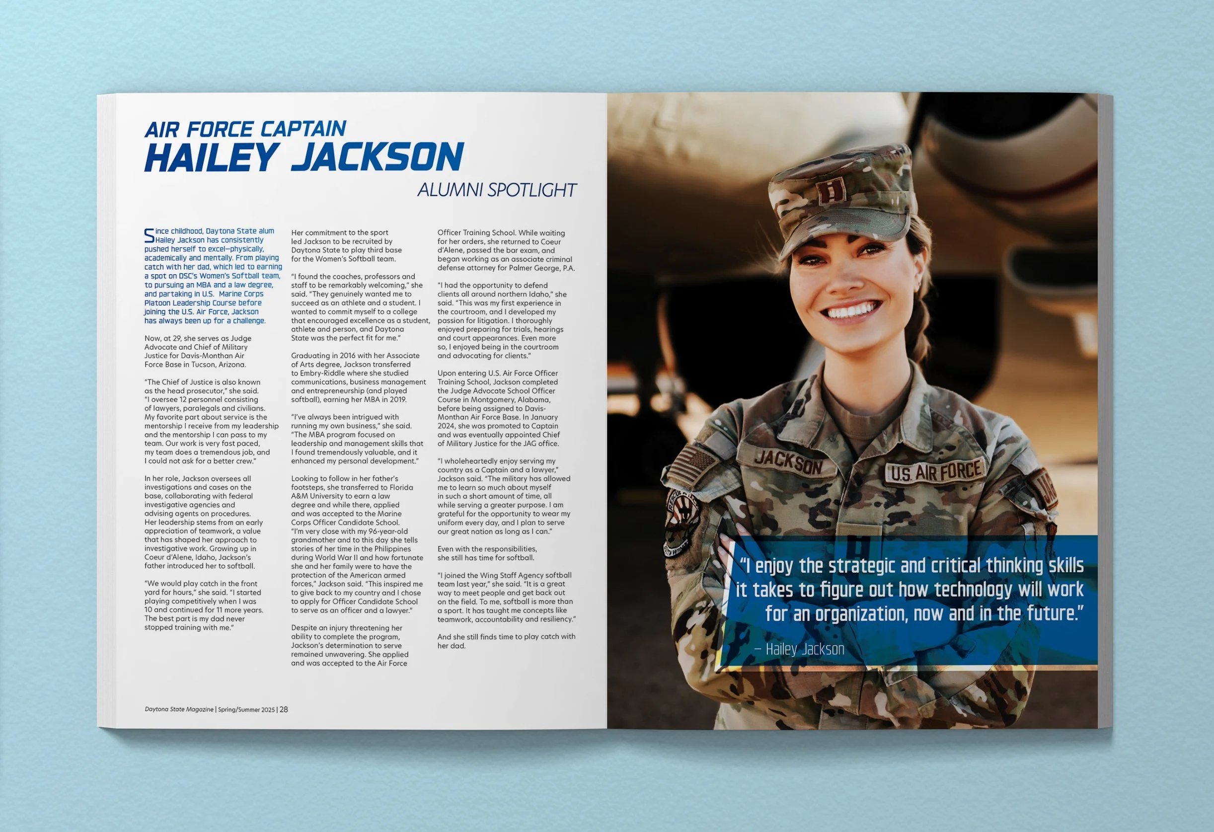
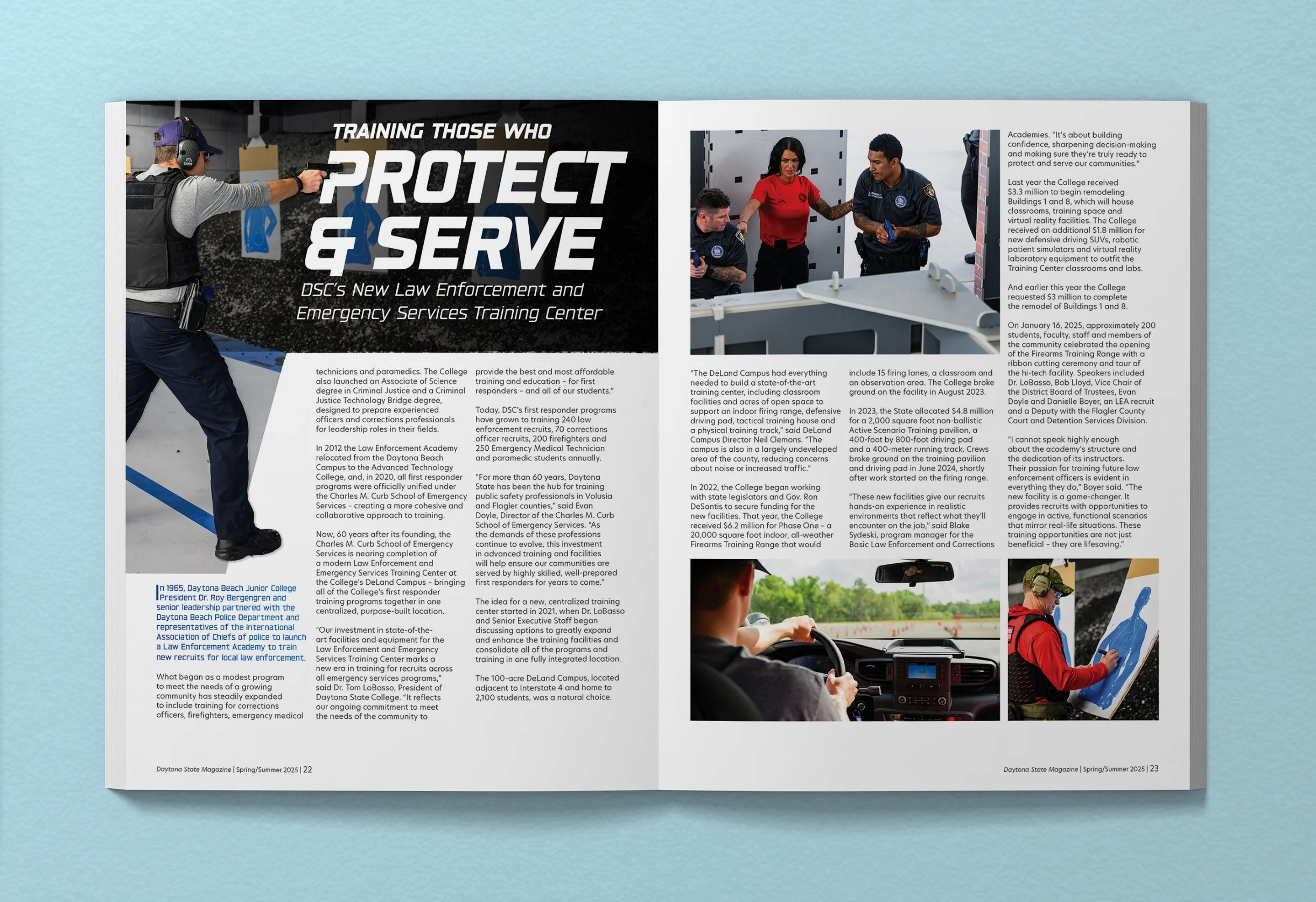
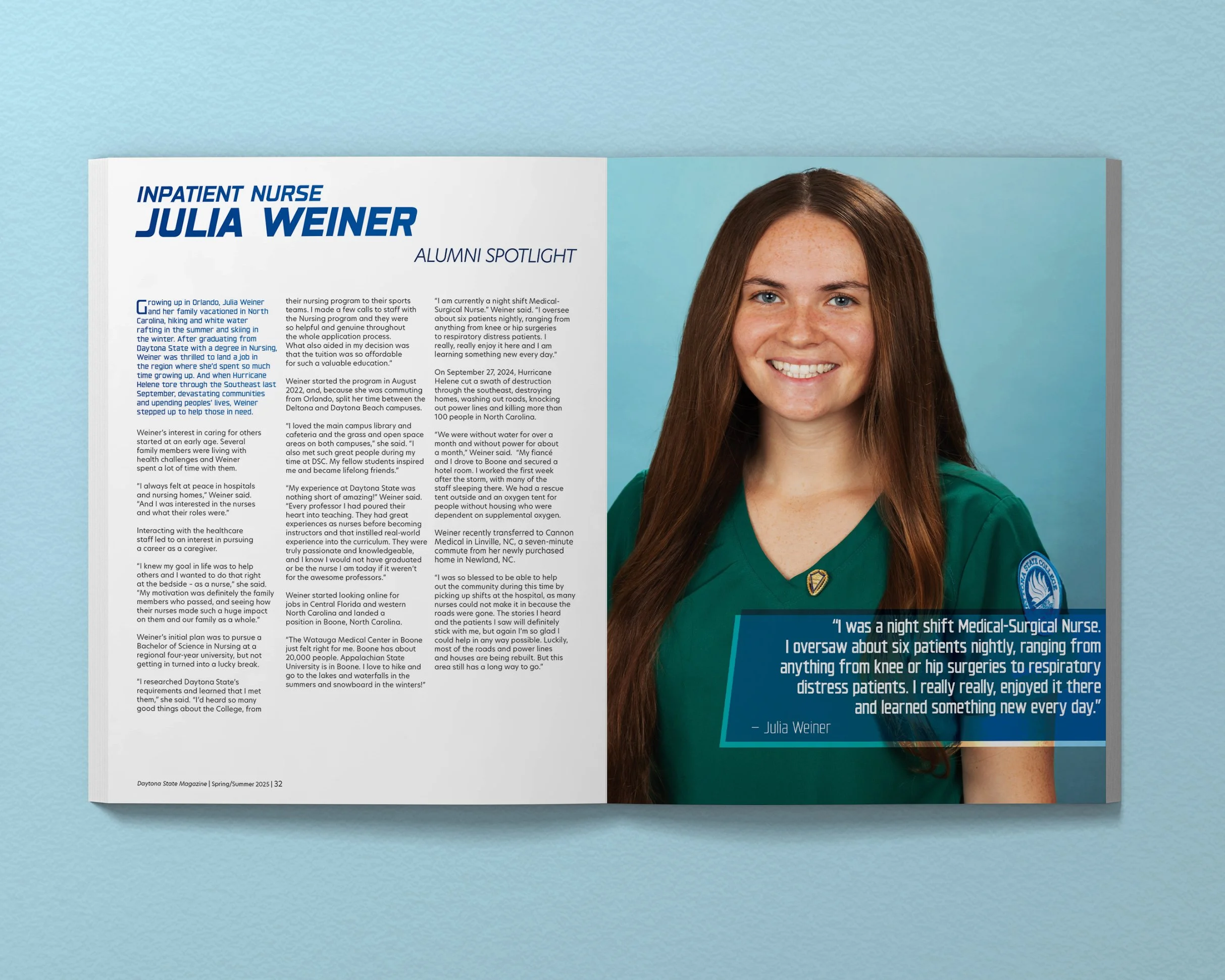
The largest solution to fixing the issue where all the spreads felt too all over the place was to install a page pattern as well as master pages and very detailed paragraph styles. Consequentially, this also fixed the issue with typesetting and formatting. In order to bring our magazine into the present, I did lots of research on timeless magazine design in addition to current trends because while trends come and go, good bones of design are forever.
-
Overall, the changes made to the design have increased reader satisfaction and made reading and navigating the magazine easier.
I art directed, designed, and edited all the photography. During the project, I collaborated with a copywriter, marketing specialist, and photographers.